 |
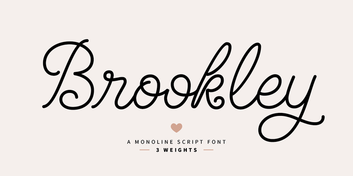
Download Brookley Font Family From Danie Type
Download Autumn Song JNL Font Family From Jeff Levine
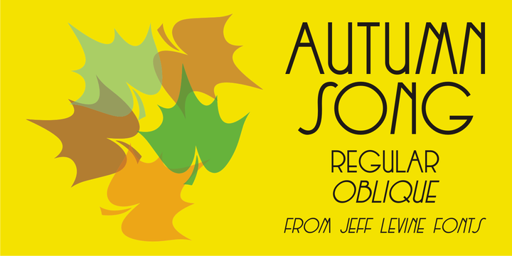 |
The cover of the sheet music for the 1931 song “When the Autumn Leaves of Life Begin to Fall” has the song’s title hand lettered in a thin monoline Art Deco Style.
The song itself was co-written by Buddy G. De Sylva, who would go on to be one of the founders of Capitol Records.
Now digitally re-drawn as Autumn Song JNL, the font is available in both regular and oblique versions.
Download Danish Script Initials JNL Font Family From Jeff Levine
 |
A set of transfer patterns for sewing decorative monogram initials on clothing was manufactured by Women’s Day magazine circa the 1940s.
Designed by renowned Copenhagen-born industrial artist and letterer Gustav Boerge Jensen [April 8, 1898 - June 27, 1954], these initials have been redrawn into a digital font entitled Danish Script Initials JNL.
Large initials are on the uppercase A-Z keys, while smaller initials are on the lower case a-z keys and are centered to the larger cap height. An ornament is provided on the asterisk key, and can be placed between the small initials and the larger initial for decorative effect.
Download Radio Show JNL Font Family From Jeff Levine
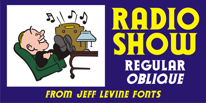 |
The 1933 sheet music compilation entitled “Kate Smith Memories Song Book” had the singer’s name hand lettered in a bold, spurred serif typeface.
This lettering design became the basis for Radio Show JNL, which is available in both regular and oblique versions.
Download Nouveau Stencil Ornate JNL Font Family From Jeff Levine
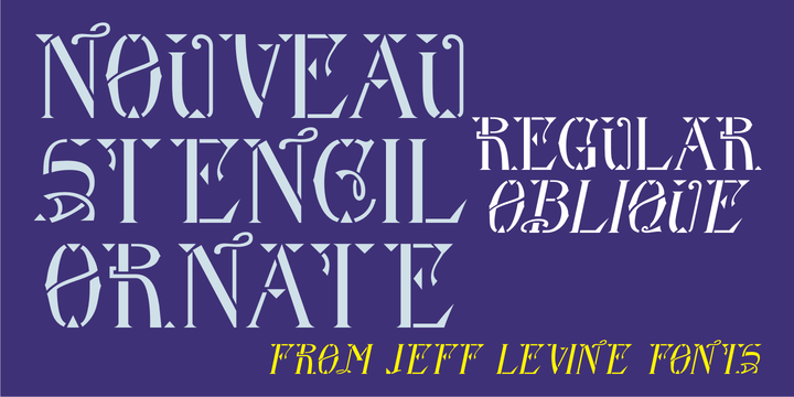 |
A 1902 publication entitled “Lettering for Schools & Colleges” had an example of an ornate, hand drawn stencil alphabet in the Art Nouveau style.
This is now available digitally as Nouveau Stencil Ornate JNL, in both regular and oblique versions.
Download Patrol Car Stencil JNL Font Family From Jeff Levine
 |
Comic books based on popular characters have been around pretty much since the advent of comic books themselves.
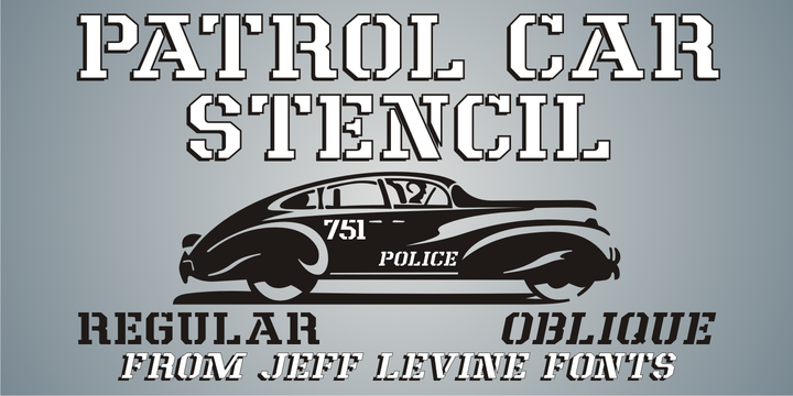
An edition of the “Car 54 Where Are You?” series published by Dell (and based on the hit TV show created by Nat Hiken) displayed “Car 54” in a bold hand lettered stencil design on the cover.
These few characters became the inspiration for Patrol Car Stencil JNL, which is available in both regular and oblique versions.
Download Quick Titling JNL Font Family From Jeff Levine
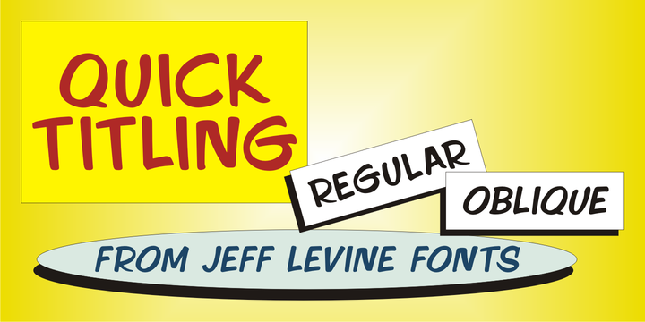 |
An ad spotted in a 1960 issue of Billboard magazine promoting a 45 rpm release by Randy Lee doing the old song “Did You Ever See A Dream Walking?” featured the song title in a casual, brush lettered style.
While the ad made a perfect model for a digital font design, the record itself tanked.
Quick Titling JNL is available in both regular and oblique versions.
Download Old Sport JNL Font Family From Jeff Levine
 |
The 1930s era French textbook on lettering "100 Alphabets Publicitaires déssinés par M. Moullet" featured a hand lettered chamfered alphabet with slab serifs reminiscent of sports lettering. Although intended for advertising and signage inspiration, only a partial lower case was illustrated along with the capitals and no numbers or other characters existed. These had to be created from scratch.
The finished result is not only a bit of classic lettering from the past, but the font also doubles as a typeface with a sports look and feel.
A traditional (rather than stylized) M and N are located on the solid bar key and the broken bar key respectively.
Old Sport JNL is available in both regular and oblique versions.
Download Desk Job JNL Font Family From Jeff Levine
 |
Desk Job JNL is an Art Deco-influenced typeface based on hand lettering found on the packaging of a vintage Hotchkiss No. 52 stapling pliers.
The typeface is available in both regular and oblique versions.
Download Handmade Nouveau JNL Font Family From Jeff Levine
 |
An example of Art Nouveau lettering (complete with its unusual characters and varying shape widths) was found in a sample from the vintage publication “Modeles de Lettres Artistiques” (“Models of Artistic Letters”).
This classic design is now available digitally as Handmade Nouveau JNL, in both regular and oblique versions.
Download French Bistro JNL Font Family From Jeff Levine
 |
The 1930s French publication L'Art du Tracé Rationnel de la Lettre was a treasure trove of font revival ideas from the Art Deco era. One example featured a serif typeface with a number of stylized characters.
This is now available as French Bistro JNL, in both regular and oblique versions.
Download Colmar JNL Font Family From Jeff Levine
 |
French Art Deco lettering found within the pages of the 1934 publication L'Art du Tracé Rationnel de la Lettre (roughly translated to “The Rational Path Art of the Letter”) have provided a number of designs well-suited for digital revival.
A hand lettered sans with varying character widths was the basis for Colmar JNL, which is available in both regular and oblique versions.
As the source of the lettering design was a French publication, the typeface is named for the city of Colmar, which (according to Wikipedia) is the third-largest commune of the Alsace region in north-eastern France.